Importance of Font and Typography in Ezines
The process of choosing the right font and typography is one of the most crucial steps when designing an ezine. This choice influences not only how easily the text can be read but also the degree of user engagement and the overall aesthetic appeal of the publication. A font that aligns well with the theme of the content ensures that the material is accessible and engaging to a broad audience, bringing together functionality and visual style.
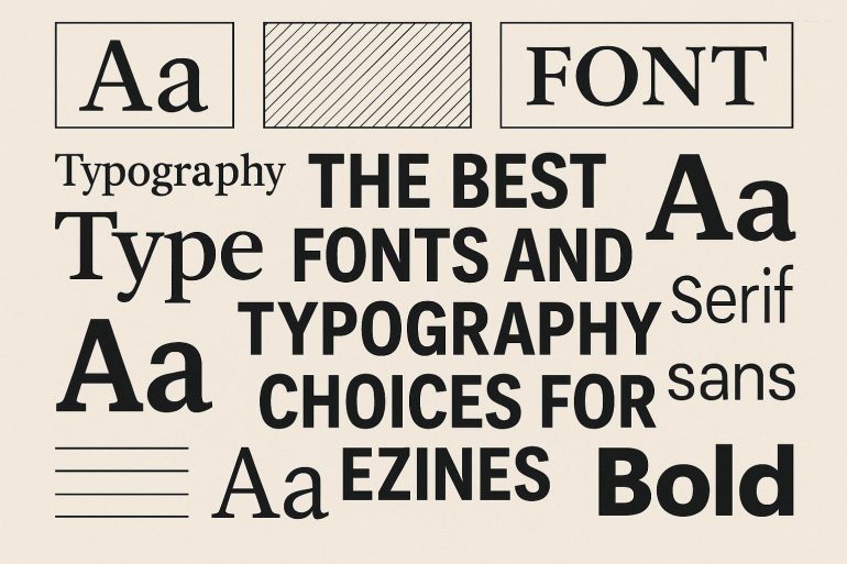
Understanding Font Categories
The selection of fonts is diverse, and understanding the distinctions between font categories helps in making informed decisions for your ezine. Each category serves specific roles and contributes uniquely to the presentation of content:
- Serif Fonts: With their decorative strokes at the ends of letters, serif fonts like Times New Roman and Georgia lend a classical, formal appearance. These fonts are staples in print media and are utilized to infuse a traditional or vintage feel into an ezine, which might be desirable for content exploring historical topics or sophisticated themes.
- Sans-Serif Fonts: Featuring clean lines and lacking the embellishments of serif fonts, sans-serif options such as Arial and Helvetica cater to a modern look and superior readability on digital screens. This makes them highly suitable for online publications where clarity and contemporary aesthetics are prioritized.
- Script Fonts: Designed to mimic handwriting, script fonts like Brush Script add elegance and flair, often used for headings or branding elements rather than body text, due to their ornamental and sometimes cursive nature, which can be challenging to read in large blocks.
- Monospace Fonts: Each character in monospace fonts occupies the same amount of horizontal space. Courier is a common example, and such fonts are exceptionally beneficial in presenting code or technical data where uniform character spacing is advantageous.
Best Practices for Font and Typography Selection
Careful consideration is necessary when selecting fonts, focusing on several important practices that ensure a harmonious balance between form and function:
- Readability: The primary goal in typography should be legibility across different devices and text sizes, ensuring that the reader’s experience remains uninterrupted and smooth.
- Appropriateness: The font choice should align with the tone and subject matter of the content. Modern, slick ezines may benefit from sans-serif fonts, whereas those addressing historical topics could better suit serif fonts.
- Variation: A controlled use of fonts—typically two to three different kinds—fosters a cohesive look. This involves choosing a main font for body text and complementary ones for headers and highlights, enhancing focus without overwhelming the reader.
Typography Elements to Consider
Beyond font choice, other typography components significantly shape the design and function of an ezine, adding layers of texture and clarity to text presentation:
- Font Size: Typically, a 16px size is recommended for the main body text, ensuring comfortable reading without straining the eyes. Adjustments may, however, be implemented based on particular design requirements or target audience needs.
- Line Spacing: Also known as leading, appropriate line spacing enhances text readability. A common guideline is to set the line spacing to be approximately 1.5 times the font size, allowing each line of text to breathe and preventing crowding.
- Alignment: While left-aligned text is generally preferred in Western publications for its natural flow that mimics typical reading habits, center alignment can be used strategically for headers or short passages to create emphasis or a stylistic effect.
Conclusion
The strategic use of font and typography plays an integral role in crafting an ezine that is both visually pleasing and easily navigable. An emphasis on readability, appropriateness, and a balanced application of typography elements can greatly enhance the communicative power and aesthetic impact of your ezine. By continuing to explore and implement web typography best practices, you can remain informed about trends in digital publication design, allowing you to produce content that stands out in increasingly visual and digitally focused environments.
In summary, each font and typographical decision contributes to the overall perception and effectiveness of your ezine, illustrating not just content but the ethos and style of the publication. Adopting a thoughtful and informed approach to typography can transform text into a compelling visual narrative, weaving together words and design into an engaging user experience.