Understanding the Basics of Ezine Layout Design
Creating a visually appealing ezine layout requires an understanding of certain fundamental design principles. The key is to design a layout that enhances readability and effectively engages readers. The design should be aesthetically pleasing while serving its primary purpose of conveying information in a clear and organized manner.
Aligning the Layout with Brand Identity
Start by establishing a consistent theme that aligns with your brand, as this is crucial for maintaining brand identity throughout the ezine. This involves choosing a suitable color palette and font style that are easy on the eyes. An ideal palette should reflect the emotions or values associated with your brand. For instance, a tech company might lean towards cool tones like blues and grays, whereas a lifestyle magazine could employ vibrant colors to evoke creativity and vibrancy.
Font styles play an equally important role. Consistency in font choices not only enhances readability but also maintains a professional and cohesive look across the ezine. Selecting fonts that complement each other can subtly highlight different sections or importance levels of content. Pay attention to text size and line spacing to ensure comfortable reading—large enough to be legible without seeming bulky. For an in-depth guide on font choices, consider referring to typography-focused resources, such as Hoefler&Co.
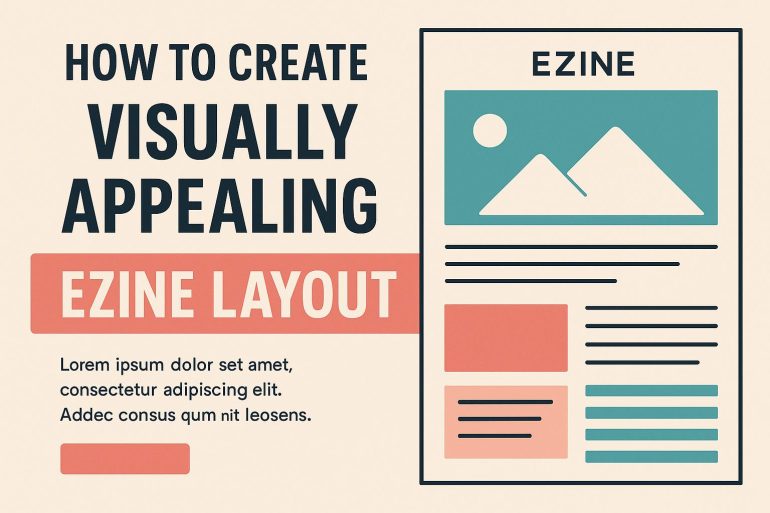
Structuring Content for Enhanced Readability
An ezine’s effectiveness largely depends on its content structure. Using logical headings and subheadings to break down content into easily digestible sections can greatly aid in readability. This hierarchical structure guides readers through the document, making navigation intuitive. For example, an ezine might employ
headings for main topics and
headings for subtopics, creating a clear visual hierarchy.
While organizing content, it is useful to incorporate bullets and numbered lists to highlight key points or steps. However, they should be used sparingly to maintain the aesthetic balance and visual appeal of the layout. Effective use of bullets and lists can help in organizing information clearly, but they should never crowd the space or draw attention away from the main content.
Incorporating Visual Elements
Visual elements like images, infographics, and videos are crucial in engaging an audience. High-quality, relevant images can break up large chunks of text and provide visual interest. Infographics can simplify complex data into easily understandable graphics, making the ezine more informative and appealing. Videos introduce dynamic content, which can further captivate readers by providing interactive engagement opportunities. Platforms like Canva offer tools that help in creating customized visuals aligning with the ezine’s overall style and theme.
Designing a Consistent Layout
Consistency is a critical component in ezine design, as it contributes significantly to readability and visual uniformity. Maintaining uniformity in margins, padding, and alignment across all pages ensures the ezine presents a seamless and cohesive appearance. Employing a grid layout can greatly assist in achieving systematic alignment, ensuring that all design elements are ordered and harmonious. Moreover, there should be a balance between text and white space; cluttered pages can overwhelm readers and impede understanding rather than enhance it.
Providing Navigation and Interactive Features
Interactive components within an ezine can greatly enhance user experience. Using hyperlinks to provide additional resources or references enables deeper engagement with content. Anchored links within the ezine can improve navigation, especially useful in longer editions, helping readers easily jump to different sections of interest. It is essential to ensure all links are operational and provide a seamless transition between content sections, enrichening the reader’s journey and supporting an interactive exploration of the ezine.
Ensuring Accessibility and Responsiveness
For an ezine to be truly effective, it must be accessible to users of all abilities and viewable on a range of devices. Ensuring adequate text contrast is key for readability; this aids those with visual impairments and improves overall readability in different lighting situations. Alt text for images should be employed for screen readers, making the ezine comprehensible to individuals relying on such technology. Testing the ezine’s responsiveness across various platforms ensures that alignment and readability are maintained across different devices—crucial for enhancing the digital experience of all readers. Resources such as the W3C Web Accessibility Initiative offer comprehensive guidelines for creating accessible digital content.
By considering these fundamental principles, you can craft an engaging ezine that not only captures attention but retains readership through its clear and organized presentation of content. In merging design with function, the creation of an ezine becomes an opportunity to reinforce brand identity while meeting the informational needs of its audience. Through thoughtful layout design, consistent thematic elements, and structured content presentation, your ezine can set a distinct standard of excellence and readability in any digital landscape.